Doc's Product Category Page


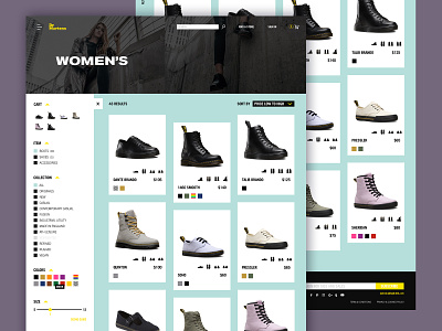
I went a bit further with my Dr. Marten's rebrand and designed out a product category page to go with my homepage comp. (Check it out!) I decided to mimic the product card style of the homepage here with the intentionally mis-aligned product cards.
I brought in the teal color from the homepage as the background, putting emphasis on this new color I created for the Doc's palette. They currently use black and yellow exclusively, but a third color balances the two out and allows me to use the yellow as more of a secondary color.
Favorite part of this page was designing the expandable / collapsable filter component. When collapsed, the products appear in a 4 column grid, but when expanded, the products shift to a 3 column grid. The filter itself is narrowed down from what is currently on the site, and placed in a much more user-intuitive place on the page.
Lastly, the cards themselves are simplified to show the only things a user needs to see at this stage of their search: The shoe itself, various angles of the shoe, the name, the price, and the colors offered.
Let me know what you think!
___
Digital Surgeons | Instagram | Twitter