Brighte Styleguide


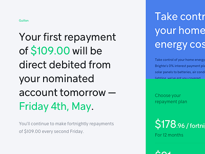
For the typeface, we went with Guillon - a beautiful, modern Montreal-minded sans serif influenced by the Swiss international style. It seemed to match the new palette and tone of voice, being simple and playful but with an aura of trustworthiness. We used a generous line height to compliment the brand's use of empty space provide an enjoyable reading experience.