02 — Photographer
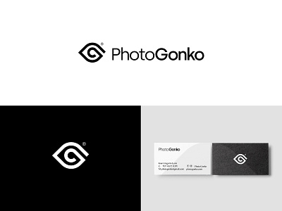
He developed a brand identity treatment based on the concept of photography, where the point of departure is to visualize each moment from its naturalness. For this reason the icon morphologically represents an eye next to the letter g as the iris. Creating a simple, robust and serious style, that manages to endure over time and adjust to different formats.
Posted on
Sep 25, 2018
More by Ruben Quiroz View profile
Like

