


Stay Organised Sketch

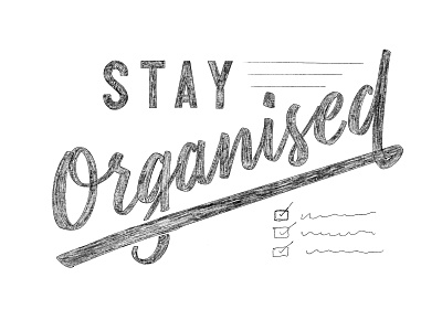
Piece of lettering I'm doing as part of a larger project. I'm super happy with how the script style has come out however that 'g' just looks awful.
Would love some feedback or ideas on how to fix it while maintaining the big underline and general width of the letters!
Thanks