Logo design
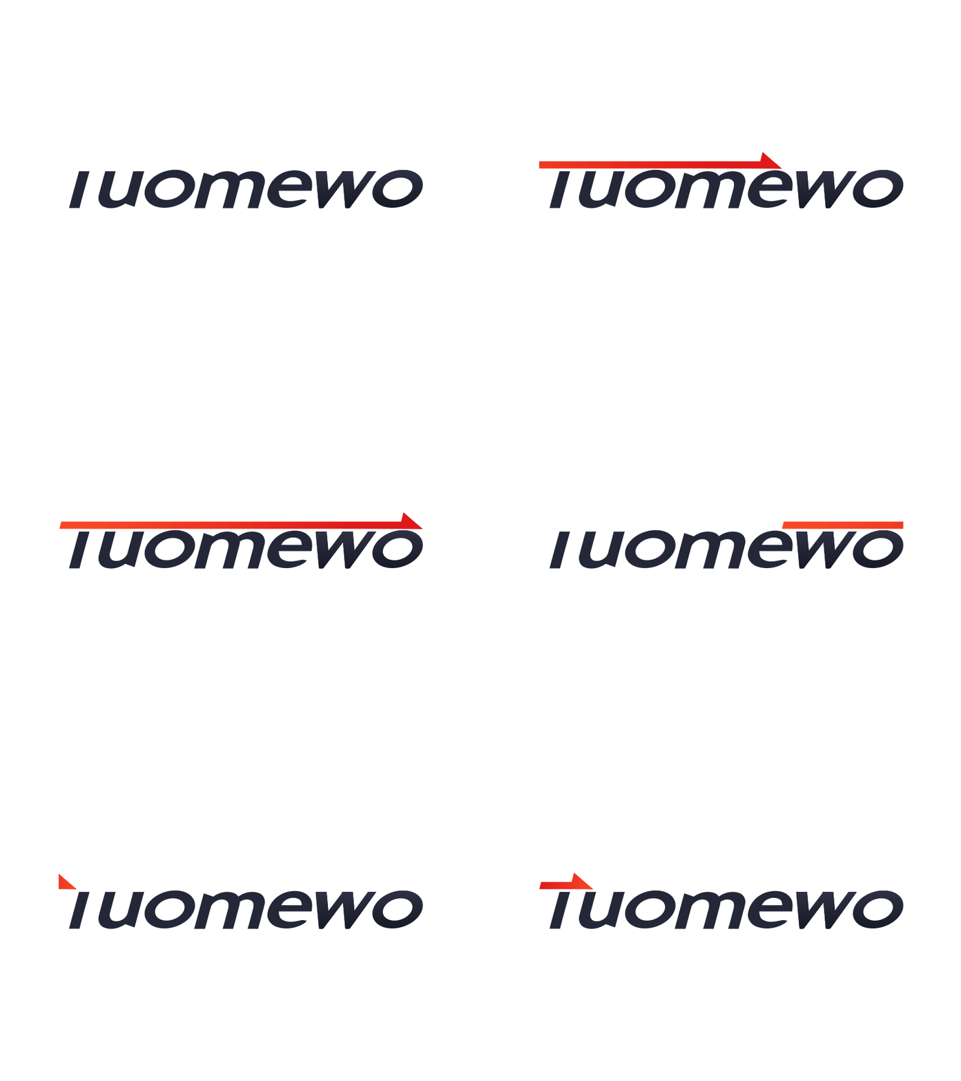
Tuomewo is a welding torch company, and the arrow symbolizes the advancement, a positive element. The design of the arrow as an alternative element replaces the upper part of T and also symbolizes the welding torch. The color scheme uses orange-red color. On the one hand, the logo design uses a different color matching design method, on the other hand, it also means the color of the flame.
More by wayneshaw View profile
Like

