Balance App Landing Page

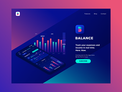

No app can exist without the landing page, even if it’s the concept design😉That’s why today I would like to present you one more component – Balance app landing.
Check the full case study on Balance App on Medium.
I still find the dark blue background is a magic thing that lets the main content stand out well at the same time hiding some elements to make it looks mysterious. One of my recent articles on Medium is right about this topic Blueberry UI: how to benefit from the dark background .
How do you find this solution? 🤔