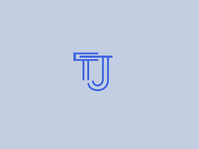
Tj
I chose to design the logo with the J overlapping the T, fitting itself in-between the gaps of the T. The following images of a T and a J was originally my jumping off point to eventually develop less curved lines and make the letters more fit for a marketing company.
View all tags
Posted on
Sep 3, 2018
More by Tyler Sarto View profile
Like

