Met Poster 2

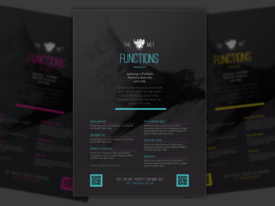
Took a tangent away from the circles and simplified things with a single colour highlight. Added a stylistic painted logo in the background for a bit of pop. Whilst I was liking the direction of a lighter version, I couldn't see it sitting well with existing style.
Don't think I need to do much more to this one -- simple is generally best.