Wordmark Design for Construction Company Logo


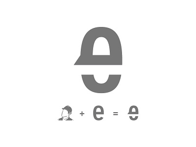


The “e’s” were customized so that they not only appear as lower case and give the logo design more distinction, but also they illustrate a worker with a hard hat on. This gives the design added meaning and appeal.