Scott's Cheap Flights - concept


This is a concept I made recently for Scott's Cheap Flights. Scott's delivers fantastic deals on international flights to its subscribers. They do so by watching for sales and mistakes made by airlines and forwarding those deals through an email newsletter.
Since the flight availabilities are usually set in the future and destinations tend to be arbitrary, I made the assumption that the fliers who most benefit from Scott's would likely be flexible with their time rather than trying to keep a rigid schedule. For instance, a couple looking for a deal on their honeymoon might find a flight and plan their ceremony around it, or enjoy their honeymoon at a different time than their wedding. I imagine that most of Scott's fliers are avid travelers who are comfortable enough to quickly jump on a deal for the sake of a new experience.
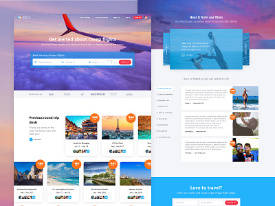
Scott's current home page makes use of a recurring CTA button, "Get Cheap Flights", which triggers a modal with an email sign up form. Instead of the button and modal, I wanted to give fliers a more engaging experience by letting them customize their alert similarly to how they might search for a flight on an airline site. They can pick a departure location, a destination, and a passenger count. I also designed in the ability to choose a season for travel to give fliers a little more control over their overall experience. Although Scott's fliers might not need the control, I think that giving them those options will likely drive more engagement than having them give up their email addresses and simply wait to see what deals they get.
Right after the "Alert me..." widget, I've displayed a list of previous deals, showing the users who capitalized on those deals. I wanted to show the main value (discounts) right away in contrast to the current site, which takes the user through a "How It Works" section before it shows a previous deal. Also, since the wide set of possibilities can be overwhelming, I think this is a good place begin injecting social credibility.
I gave a lot of real estate to the testimonials section of the page, starting out with video stories, and then combining testimonials with the different use cases found on the current landing page. I took it a step further by giving visitors the ability to filter the testimonials by use case. I know that if this site were to be built Scott's would have to invest quite a bit of time and money creating this content, but I think the stories that come from experiences like these are compelling enough to entice adventure seekers to sign up.
Finally, we close with a simple email signup form (or social signup) and a cleaner, lighter version of the footer.
Thanks for reading : )