M-Pill
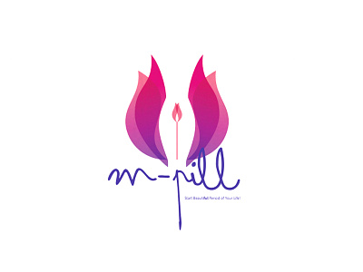
The inspiration of the logo is a flower with its natural beauty, freshness and colours. A flower symbolizes good health and happiness. Flowers are loved by women and the logo will at a subconscious level inspire our potential clients to go for the product. The logo with reinforce the confidence that this product will improve health and well being of a woman in her later years.
Neutral space: The neutral space inside the logo is in the feminine form which shows that the product is all about her. The flower wraps around the feminine form making it clear that the M Pill will wrap a woman and give her vitality and good health. At the centre is the small bud depicting the innermost part of a woman which is source of her being and the product will restore her lost vitality from within.
--------------------
This is my first shot!
I am very happy to be a part of this wonderful community!
Thanks @mihir upadhyaya for the invitation

