


Final Headspace Logo Redesign

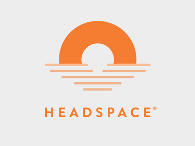
Headspace meditation mobile app logo redesign. I want to highlight the arc shape, which can stand for a meditator's strength of mind. The mark can also be seen as a sunset on the horizon, which can be one's focal point when he or she is meditating.
Furthermore, I modified the type such that the two letter A's have subtle arcs on them. This is to emphasize how stable one's mind can get by practicing even just ten minutes of quiet time a day using the mobile app.