Sharp

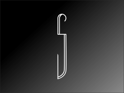
Thirtylogos.com design challenge day #16 is sure to slice through the competition. Sharp Knife Co. creates high quality cooking knives that come in every form a kitchen might need. They requested a black and white minimalist logo to feature very subtle details. My interpretation on this was to incorporate an S for Sharp into the shape of a knife. After a few sketches, this one stood out more then the rest. Let me know what you think! Any critique would be more than welcome and appreciated. Enjoy!