


Citi Bike Icon

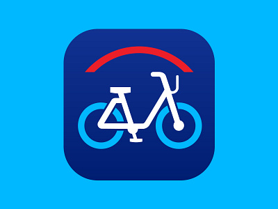
Continuing my unsolicited redesign streak by suggesting a new icon for the Citi Bike app that is clearer and doesn't overload the small space with unneccessary branding. Making a simplified bike the focal point and using the red Citi arch and colors to indicate the branding make the icon more discernable at a glance.