Lettering shot: Charon

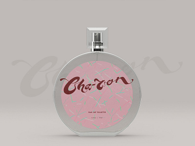

Found that the style of this lettering fits a perfume package well, so thought it would be nice to present it in such an environment. Charon here is a randomly picked name.
Liquified style of the letters is inspired by Art-Nouveau architecture and 60’s poster art. I like this little bit of deliberate jumbleness in letter proportions which makes it more interesting to read and look into details.
Minimalistic, vibrant package design brings up vibes of purity and tenderness.
💚That sweet pattern by: https://deli.artstation.com/