Dashboard Interactions

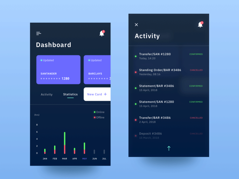
Here are some transitions from the dashboard section. I feel it's good to communicate the interactive side of the design, as opposed to still shots that might look nice but prove difficult for the user from a functionality standpoint.
Thankfully, the UX planning has paid off with this project so far... If you like this example, you can also check out the rest of the screens under this project!