Call the security!

This is going to be another oldie..
Everything was way different back in 2012 when I made this logo. For starters, learning Illustrator seemed like an impossible feat so I would use photoshop for everything. Web design - Photoshop. Logo design - Photoshop. You needed a tri-fold? Don't worry I'll make it in Photoshop.
It was the wild west back then - fake 3d, gradients and crazy fonts, web 2.0 design still reigned supreme.
But then i found it.. the website with the complete works of Stefan Kanchev. I've heard that there was a Bulgarian designer that was among the best in the world. That even more than 10 years after his death, people from around the world would still be amazed by his artistry. I found his collection full of striking and clean works. And then it all changed.. Screw web 2.0, I'll do clean logos from now on!
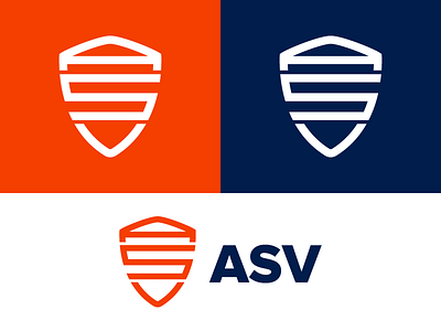
At the same time there was a contest for a logo for a security firm, ASV. A dull brief, a small prize, but still a chance to demonstrate my new "design philosophy". And I lost to the most "web 2.0" logo ever :D
Yesterday I found the psd work file and decided to fix it up a little bit. But the main idea behind it is still the same and I think it didn't age one bit. I'd like to think that this was a turning point in my "career".