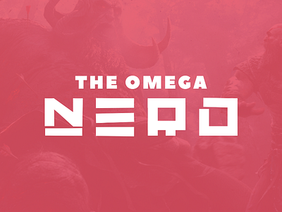
The Omega Nerd - Re-Branding
The Omega Nerd - Re-Branding: http://bit.ly/2rsLMfG
The Omega Nerd is back with a fresh new re-brand to take on the hardest bosses and the most challenging levels.
It's allways fun to work on somthing design related with The Omega Nerd since I'm always free to just play around and learn new skills.
For this tasks I had the channenge to re-brand his idenity into something fresh. So I set out to try and create that and came out with this two tone style type face that both reflects the style and idea behind the brand. The colour red is something that has always been within the logo ever since the fist design and I felt like its time for it to have a bigger effect on the overall design allowing the logo and type to really pop.
Learn more about The Omega Nerd:
Website: www.theomeganerd.com
Twitter: twitter.com/theomeganerd
Youtube: www.youtube.com/user/Nerdcore85
