Light Up Lowell Logo

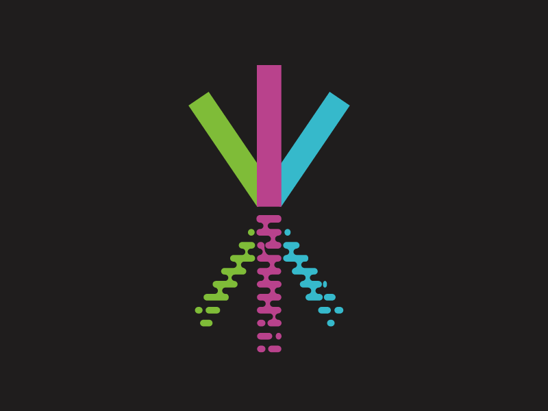


This is a logo I created for an architectural lighting installation that was installed on a local bridge, called Light Up Lowell. Each truss has an individual LED that can act as a pixel in a larger composition. To start it is programmed for your basic holidays, and there are plans to open it up to community submissions.
The logo itself calls back to the two taller truss sections which are the most iconic part of the structure. The idea is to show an abstract form of the trusses reflecting in the river, as that is also part of the overall composition created with the architectural lighting.
In keeping with the theme, each of the thirds can take a color from the lighting scheme defined on the bridge.
In non-color or low color applications, the single color version is green, which matches the daylight color of the structure. It also is set up to work in black or white variations.