g

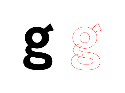
I love drawing lowercase two-story g's. They're really difficult to get the weight distribution right on, but you can make them very stout and cute. I just drew this bad boy for a wordmark. The middle stroke kinda sits like a spine holding up the big head, and the bottom stroke is like a leg delicately tucked underneath. And that big circular counter on the top is like a wide, innocent eye. It looks like a baby quail with scoliosis. Put that in your type design e-book and smoke it.