


Liberty Slicer Logo

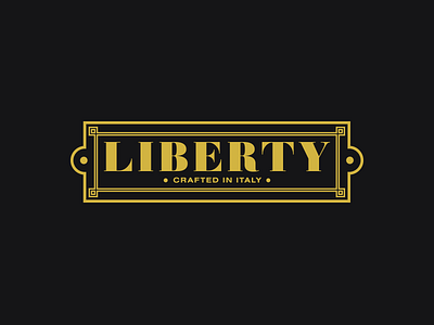


I've always been very fond of this product identity project. Although the logo is not particularly technically impressive, I'm really proud of how perfectly it fit the product and brand.
The client sells antique meat slicer reproductions, and needed a logo that was modern and consistent with other branding efforts, yet fit right in with the classic style of machinery it would be placed on. The logo itself was inspired by the steel product plates that would traditionally be placed on the side of the slicers.
Special thanks to Giacomo Reni out of San Francisco, who is the product photographer that took the shots in the attachments.