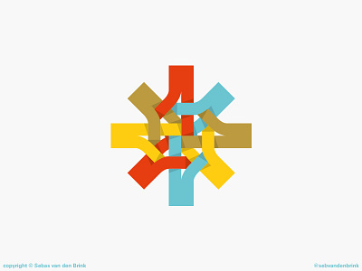
Weave Logo
Here's a logo concept that never made it past the concept stage, probably for the better - it's so convoluted! It was fun tying all the strands together AND giving it a bit of shade - but it wouldn't have worked well in black and white and it would've been hard to reproduce in certain circumstances. Logos should really be more like letters, in my opinion, and this wasn't it.
View all tags
Posted on
Apr 15, 2018
More by Seb van den Brink View profile
Like


