


Polaris Test Squad (PTS) Logo

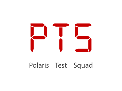
Logo for an analytics-based alert platform. This tool is used to send automated alerts whenever metrics drop below a certain thresholds.
I stylized the main letters as LCD characters, similar to what you can see on a digital alarm clock. The red color is meant to further enforce the "alarm" nature of the platform. Subtext explaining the acronym "PTS" is present at the bottom for those coming upon the logo within a directory.
I noticed each word of the subtext (Polaris, Test & Squad) is roughly the same width as its associated initial above so I thought it would be interesting to align them thusly
P is the first letter, meaning Polaris is left-aligned
T is center, so Test is centrally aligned
S is the final letter, making Squad right-aligned