


Geekometric Identity

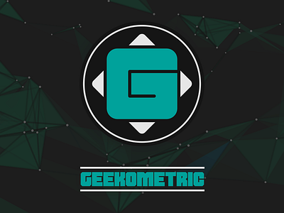
I have a blog on which I review movies and video games, mainly. After several years with a quite basic logo, I decided to revamp it.
The main idea was to have a grid to form the G, sitting between four triangles, illustrating a game controller D-pad, as my blog mostly pertains to video games.
The text logo below is used for wider contexts, keeping the geometry sharp.
{FONT: Shumi, modified}