


Windows 8 Logo

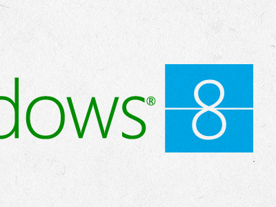

Like most people I am not thrilled with the Windows 8 logo. Most people's issue is that it's overly simplified, but after thinking about it a bit I realized that simplification is not its problem. The problem is that the design implies it was driven by the new Metro interface, except in Metro there is almost no perspective or 3D effect. It's basically all flat.
Additionally, I was not keen on losing the color scheme that Windows has effectively owned in its logo for decades (red, blue, green, yellow), but then I thought about this some more and made another realization: this color scheme now belongs to Google (every one of their products uses this color combination).
So narrowing things down even further, I realized the real issues at hand were: the logo should be simple like Metro, the logo should be modern, and the logo should reference its color equity without looking like Google.
The end result is this little toy. Instead of emphasizing a skewed window, I elected to emphasize the 8, and in it reinforce the Metro rectangular elements. Then I thinned out the font significantly (using Segoe, not Myriad), and brought back in green and blue, which together I feel make a decent reference to Windows color schemes without looking like Google.
Done just for fun, of course. (See full file)