Nike Website Gallery Page Experiment


Sup guys,
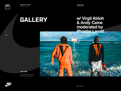
We’ve experimented a bit with how Nike Gallery pages may look like. The one you see above is about Nike collaboration with Virgil Abloh, a designer who reconstructed 10 Nike footwear icons in the collection called “the Ten”.
Our main objective was to make it look fresh, unconventional and consistent at the same time. Kind of well-organized, stylish mess, you know.
We played with the geometry of layout and composition, used broken grid and tried to apply smart whitespace utilization. We used black & white color palette to give the page a stylish look. The only bright thing here is the visual which is the main element and supposed to be catchy.
Here’s what we ended up with. Wonder what you think of it. Feel free to share your opinion and ideas, would love to hear from you ✌
Press "L" to show some love!
ᗈ Join our Newsletter! ᗈ Website ᗈ TheGrid ᗈ Spotify ᗈ Twitter ᗈ Medium ᗈ Facebook ᗈ Instagram