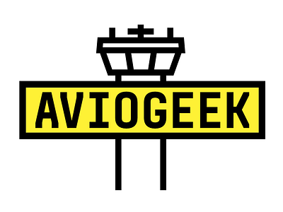
Aviogeek.com logo
Final design for the http://aviogeek.com logo. To fit better to the website, the tower is centred. Font used is beautiful monospaced Realtime, which reminded me of airport's timetables. The contrast of yellow and black was inspired by signals and markings along the taxiways.
More by Branko Šabarić View profile
Like

