Bukalapak : How I Fix The App?

@Bukalapak is one of Indonesia's most prominent player in e-Commerce platform which recently received the Unicorn title, alongside several other Unicorn-level startups such as @GO-JEK , @Tokopedia and @Traveloka .
As a "future figure" of our massive national startup growth towards international stage, @Bukalapak smartly engineered, polished, and deliver their product to the tip of our hands : @Bukalapak e-Commerce app for mobile ( Android and iOS ).
In short, the product immensely connects and create humongous independent business opportunities for the people, increasing our human resource potential in the latter.
This is my work in optimizing the UX of the app which focusing on two pointers : Home and Purchase sections. These are the minor issues I fixed :
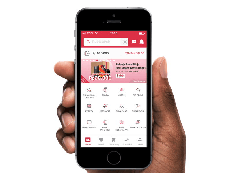
A. Home
1. Least void in between statusbar and header search label
2. Least void in between Bukadompet and main services
3. Ambiguous location of 'Popular Search' main label
4. Ambiguous 'popular search' sub-label sizes and alignments
B. Purchase
1. Overused #D72249 HEX in between product details header and details footer
2. Unbalance size of Bargain label, yet strange yellowish-orange color combination which among #D72249 dominance in the header / product details
In-depth UI : https://www.behance.net/gallery/62198961/Bukalapak-Optimized-UI