Harding Racing Logo

How often do you get to design a logo that travels 200 miles per hour? As Indianapolis natives, we were proud to embrace our speedway heritage and design the Harding Racing brand.
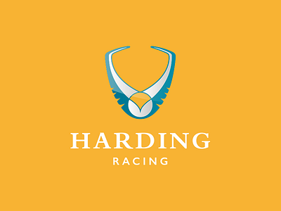
After some serious concepting, we created a logo that symbolizes tradition, movement, swiftness, and strength. Inspired by the Harding family crest, the mark incorporates a swallow-like bird, representing perpetual movement and swift intimidation. Just as a swallow rapidly navigates the air, diving and turning at the flick of a wing, Harding Racing nimbly and quickly navigates the racetrack, serving as an intimidating force and fierce competitor. The wings of the bird in flight also create the shape of a shield or crest, symbolizing strength and solidarity while nodding toward the sense of tradition within the Harding family. The mark serves as a symbol of solidarity for the entire Harding Racing family as it gains momentum and success across racetracks on the national stage.
It's history in the making!