Affinity diagram

Hello everyone, This is part of my old project “Admission Campaign”.
In the previous entries, it was proposed to check the flows of the different subscription forms for the admission campaign. However the main web, where these forms are located, still has disagreement with the stakeholders despite of their two relaunches.
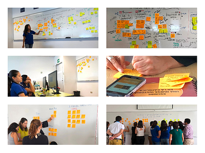
That’s why we proposed an affinity mapping with the collaborators. There were 14 Chiefs, 8 Guides and 14 Guidance out of 300.
In this workshop, a protocol was created and based on KJ Technique (https://articles.uie.com/kj_technique/) to identify the main faults perceived by the workers of the area.
We divided it into two big phases: the first was to identify problems (individual stage) . The second was catergorization and voting.(groupal and individual stage). Finally the collaborators managed to share their problems and solutions through a representative.
To get the documentation we use an app that I recommend called “Post It Plus” and to cross the information between groups we use Mural (https://mural.co/).
I hope to show you in the following weeks how we will get the results and how they will manage to improve the main website.
Current website: http://zonaescolar.pucp.edu.pe/
Suggestion are always welcome!
Thanks for the support!