Empty State for Enterprise Users

👋 Hi Dribbble!
I thought it would be fun to debut with an unglamorous often-overlooked part of design: an empty state.
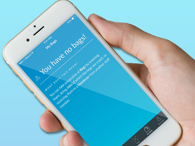
In this case, the app is mostly white and grey, so a full-screen brand colour (with a cheeky gradient) alerts users that action is required. There's a straightfoward error message, and a clear prompt to action with no jargon.
Intuitive error messages and empty states are invaluable in any digital product; without them, your users will desert you quickly.
To see more, visit my portfolio: https://www.edcarroll.design/
Thanks for having me!