


Mobile banking app visual contrast exercise

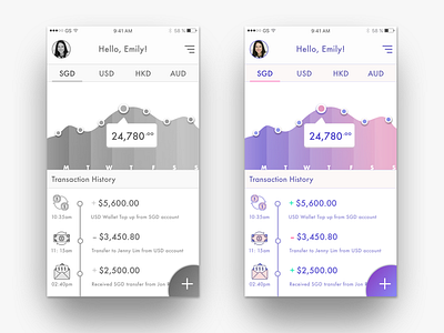
I tried a new way of keeping visual contrast consistent with color by starting with black and white. When desaturated, the black and white version of the same design still maintains the same visual vocal point that users should focus on.