Typedelic Posters
I am excited to be a chosen artist for the newest series of typographic posters for Avondale Type Company, based in Chicago. The ATC Artist Series III is an illustrated exploration of the alphabet, highlighting illustrators and designers from around the world. Now in its 3rd year, the artist series boasts over 50 of the worlds leading illustrators from over 15 countries.
The premise is simple, an artist takes two letters, one symbol and the ATC logo and interprets it, using one ATC typeface, in any way they see fit. Outside of these guidelines, the interpretation is entirely up to the artist.
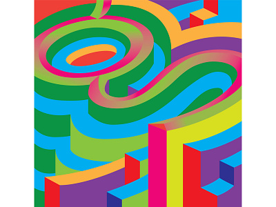
I chose the typeface ATC Harris, a monospaced sans serif, because I was charmed by the two-storey lowercase g and the ampersand. The monospacing meant that normally narrow characters like the lowercase t are wide in order to fill the space.
My design started with creating a feeling of a three-dimensional space, but then I explored how highlight and shadow can inform (or confuse) the viewer about space. I replaced light where dark might be in some areas. Flatness and depth are competing with each other. Inspired by psychedelic posters, I used a lot of colors with similar intensity next to each other. I titled this series Typedelic.
After I completed the designs I realized they reminded me a little bit of pinball machines!


