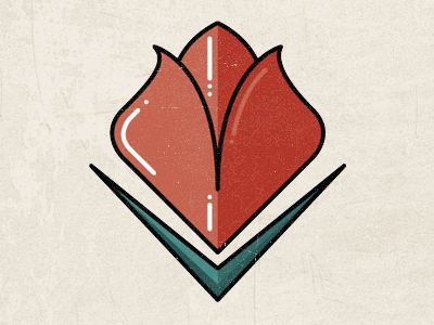
Tulip logo

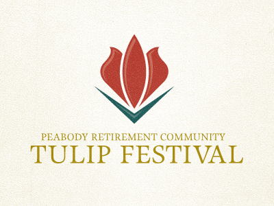
Refined my original idea. The client wanted something to match their current branding — something that felt classy, professional, and dignified. I played off the shape of their current logo, transforming the diamond into the tulip and the chevron into the leaves, all while keeping their colors and overall style. Thoughts?