New Wellsprings Logo

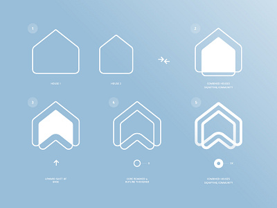
The logomark is made up of the "W" for Wellsprings and the shape of two modified house forms. The form is signatory, authoritarian and friendly. The linear execution emphasizes space, gives a sense multiple housing, communicates upward dynamism and most importantly, symbolises community.
The Wellsprings logomark is easy to recognize and seems very familiar because of it's denotative ties to the basic form of a house.