Mail WIP

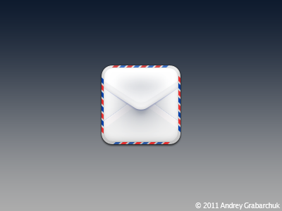
My latest work. The subtle contrasts in the shades of white and soft gradients is much more pronounced on the retina display, and looks great. I may add texture to this, and I need to adjust the trim colors a bit. Thoughts?
EDIT: I feel I should add, this was very much inspired by @William Szilveszter 's mail icon for Jaku. He critiqued it along the way and helped influence it's final form. I consider it almost a joint effort icon.