


Space - #ThirtyLogos

Space - Day 1 of the 30 Logos challenge!
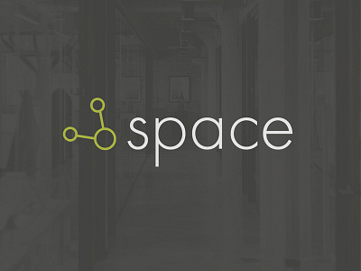
Brief: "Space is building coworking offices so that freelancers and small startup companies have a stunning office to work out of without paying the big bucks to buy or lease a large building. For the Space logo, we want to capture the idea of a personal, modern, and fun shared office space."
Idea: The icon has a double meaning: an alien with antennae, a close relative of the Share icon (because the offices are a shared community). Went with a lowercase type because for a more personal, less stiff feel. The green represents both the open, happy workspace, and the little green men. :)