Octopus Card Redesign 八達通卡 重新設計

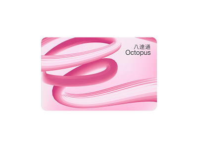
用抽象線條的方式,代表八達通卡連結各方的企業精神,柔中帶剛的色調,適合大部分女性用戶。
Octopus Card Redesign
八達通卡 重新設計
20th Anniversary Edition, purely redesigned, not a real release version.
20週年記念版本,純粹重新設計,並非真實發行版本。
Reference:
參考資料及來源:
https://www.octopus.com.hk/tc/consumer/octopus-cards/products/limited-edition/20th-anniversary.html