


Redesigning GratefulGatherings.org - Part 1

I partnered with Grateful Gatherings, a nonprofit in the Bay Area, to redesign their website and user experience. The bulk of the work took place from October 2016 to our launch in February 2017, but I’ve been with them since to iterate the site based on user feedback and needs of the two cofounders.
View the site: https://gratefulgatherings.org
More on my design process: http://bit.ly/2nwNigi
The non-technical cofounder needed the site to be hosted on WordPress since she is comfortable with the CMS interface and is responsible for web content and blog posts. Other constraints included launching the site in time for their Spring Fundraiser (March 2017), to design with the existing purple and peach colored logo, and to do a better job featuring their main sponsor, Chipman Moving Services.
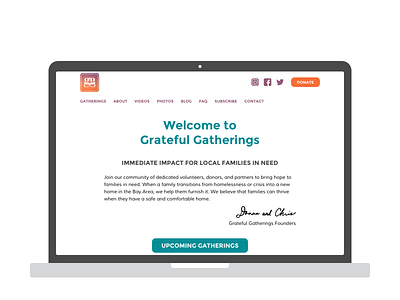
The cofounder’s original hypothesis was that the site needed to feature ‘big, beautiful images’ to help tell their story and engage their users. I conducted four 1:1 interviews with power users and surveyed 175 other users with Google Forms to learn about their needs, goals, and relationship with Grateful Gatherings. We found that people already understood “their story” and only expected to see images on social media or in the recap blog posts after a volunteering event. Instead, people were confused about upcoming events and could not find how to volunteer or donate.
As a result, we used the homepage to feature a donate button, social media links, and a hero section that promoted “Upcoming Gatherings.”
Thanks for checking out my work!