


Bangkok.com: a Material redesign (mobile homepage)

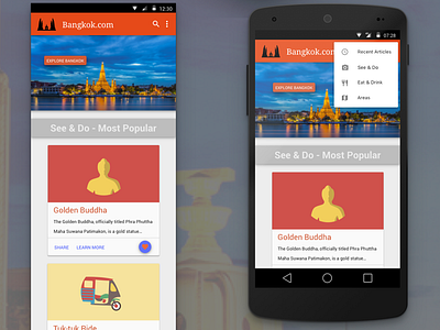
Google's Material Design (MD) language – with its emphasis on “bold, graphic, intentional” imagery – provided the perfect foundation upon which to build this redesign. My research on Bangkok and Thailand revealed that Thais have assigned a colour to each day of the week. I selected two of these colours (orange and blue) to use in the redesign, as these are complementary colours that work well together and would provide a vibrant palette. The palette was also inspired by the bright orange robes worn by Thai Buddhist monks.
Overall, I believe this redesign does a good job of capturing the vibrant spirit of Bangkok, whilst staying true to the MD guidelines.