OKC Thunder Monogram Logo Concept

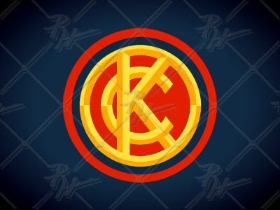
Here is my idea for an Oklahoma City Thunder rebrand. The colors here convey the idea of a thunderstorm rolling in around sun-down. The monogram is reminiscent of a branding iron which evokes imagery of the ranching history of the state of Oklahoma.