Improving Podcast Player Screen


When we launched Spreaker Podcast Radio the first time, it had fewer features than today. Back then, we didn't know how successful the interactions on this screen will be, and what actions will be used the most.
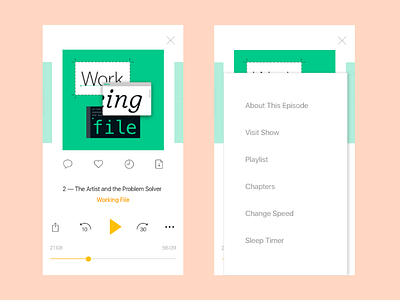
The current player screen is packed with various features, that makes the interface a bit heavy and less clean. We also used podcast show artwork to dissolve in the background. Yet, since most podcast artworks contain text, the interface becomes even messier.
I analyzed a little bit, what remains the top features our users interact on daily basis. Based on this data and typical intuitive patterns, I redesigned the screen to be more simple, lighter, and minimal. The UI is displayed in both: light and dark themes.