wt logo

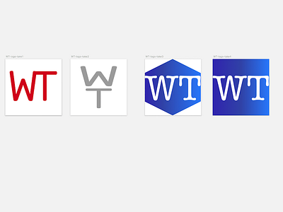
I get a call from a friend. He needs a logo for a new blog he's launching. After a few doodles, things fell in place. This shot shows the design iterations. You can tell I'm going through a minimal phase at the moment. I could write pages of text about the deep meaning behind the placement of the glyphs because they're positioned in a very deliberate manner that alludes to the message behind the blog, but as I'm not telling yet, I'm going to keep you all in suspense... yes, the earlier iterations are awful, but that's how things are... and, to be blunt, doesn't everybody get bored seeing dribble full of nothing but highly polished shots... sometimes its good to see the unpolished mess that came before.
And for those who are into deep background designer info... when making this logo I was listening to the excellent latest album from Andy Pickford (https://andypickford1.bandcamp.com/album/orgonon).