


Daily UI Challenge 025 - TV App

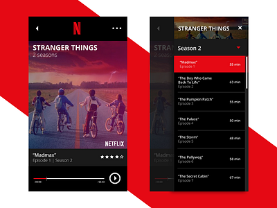
In anticipation of Season 2 of Stranger Things, I gave the Netflix Mobile App a refresh.
I've noticed over the course of this challenge that I often rely on the use of white space when designing. Though it's often the right choice, it doesn't fit every need. Netflix does a great job of this by recognizing that people don't want to be blinded by white pixels when they're streaming a movie in bed or on an overnight train ride. That being said, here's my go at reimagining the Netflix mobile app.