


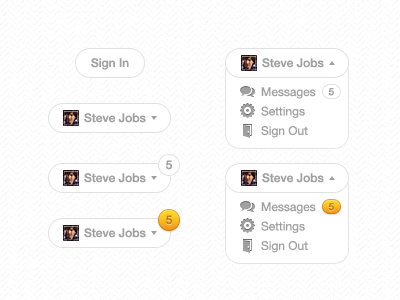
User Dropdown

With alternates: http://idzr.org/d72r
This dropdown will be shown in the top right part of the website. I'm not sure whether I should use the organge colour (that is seen throughout the site) or stick to a white/grey. There are a couple alternates shown in the link above. Should I give more padding around the small badge? If I do, should I also increase the width of the bubble before it's dropped down? Should I keep the large badge along with the small badge?
I wish I could show you more than just this small part of the site, but it is being kept a secret. Also, being the only designer on this project, I need you to please let me know how I can improve upon this.