iCommons Logo Sketches

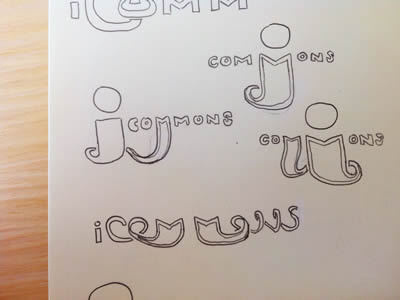
A peek into my sketchbook from a while back, these were just a few of the many sketches I did while working on the branding for our group at Harvard, named "iCommons." After many concepts and iterations, I was overruled as decision maker and we ended up with a logo consisting of a 1-color shield (how original) containing the letter "i", slightly tilted, written in Chopin Script.
Yes, it hurts just thinking about it.