


Paris Je T'aime

I was lucky enough to be asked to participate in Netmag's Design Challenge this month — designing a site for a fictional cabaret act.
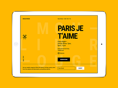
I thought it would be an interesting challenge to convey the fun, energetic, “rowdy music hall” vibe of a cabaret in a modern, minimalist way — like a Swiss poster from the 60s.
Starting with a mashup of historical references to cabaret’s roots in turn-of-the-century Paris, I looked at posters designed by Toulouse-Lautrec and Jules Chéret to figure out what content I’d need. Borrowing from their color schemes, I used a rotating palette of red, blue, and yellow for the background but kept all of the foreground content black and white for maximum legibility.
The typography is inspired by the blocky condensed lettering found on marquee signs and helps to pull a bunch of historic references into the 21st century.
Some of the original Parisian cabarets, like Le Chat Noir, published weekly or monthly magazine that included poetry, short stories, political satire, and the goings-on of the cabaret and the neighborhood. An email newsletter would be the obvious, modern-day version.
Since I design right in the browser, I made an actual website. I used CSS for all the animation and took advantage of Flexbox, viewport measurements, and my favorite CSS framework, Tachyons, to create the exact poster-style layout I wanted. I also couldn’t resist designing a simple little windmill logo then animating it to make it rotate.