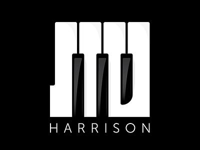
Stu Harrison Music Logo
Here’s one from the archive. A logo I designed for a music production company Stu Harrison Music. I still really love the concept and I think the optical illusion works, but the execution feels dated to me because it looks a bit like a old-timey western font with those big slabs, which I was not aiming for. Maybe I’ll take a shot at a redo sometime.
More by Jordan Wan View profile
Like

