Train Album Redesign
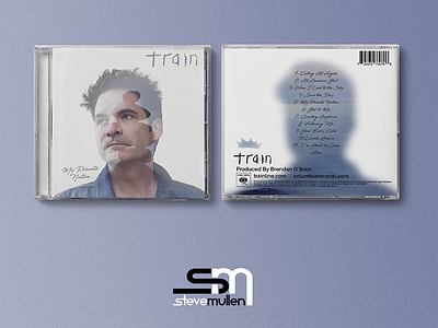
At the beginning of my education in design, I had to redesign an album and I chose Train's "My Private Nation" since that was one of the only CD's that didn't seem to fit in with all the others. Their name was written differently and the artwork seemed very dark compared to all of the other bright contrast artwork on the rest of the albums. The double exposure was actually something I just played around with and this accidentally happened so I kept it.
This is a redesign of a redesign. The original redesign was good but seemed a bit over-designed, plus I used another different typeface for the logo/ band name. This design falls in line a lot better with mood of the music.
View all tags
Posted on
Aug 12, 2017
More by Steve Mullen View profile
Like


