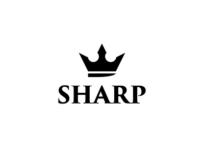
Sharp - 1 Hour Logos - Thirty Logos Challenge Day 16
Sharp creates high-quality cooking knives and the logo was meant to reflect that. I chose a crown to represent quality and worked in a knife blade because you know, they make knives. The typeface choice was tricky for me on this one. I knew I wanted a serif font because it gives a more premium feel, but finding the right one was difficult and I'm not sure if this was the right choice. Ended up going with Trajan. Let me know what you think overall!
Please appreciate the project on my Behance: http://bit.ly/SeanCBe
And follow me on Instagram: http://bit.ly/SeanCIG
View all tags
Posted on
Jul 11, 2017
More by Sean Campbell View profile
Like


